3 Ways to Boost Search Visibility and Engagement!
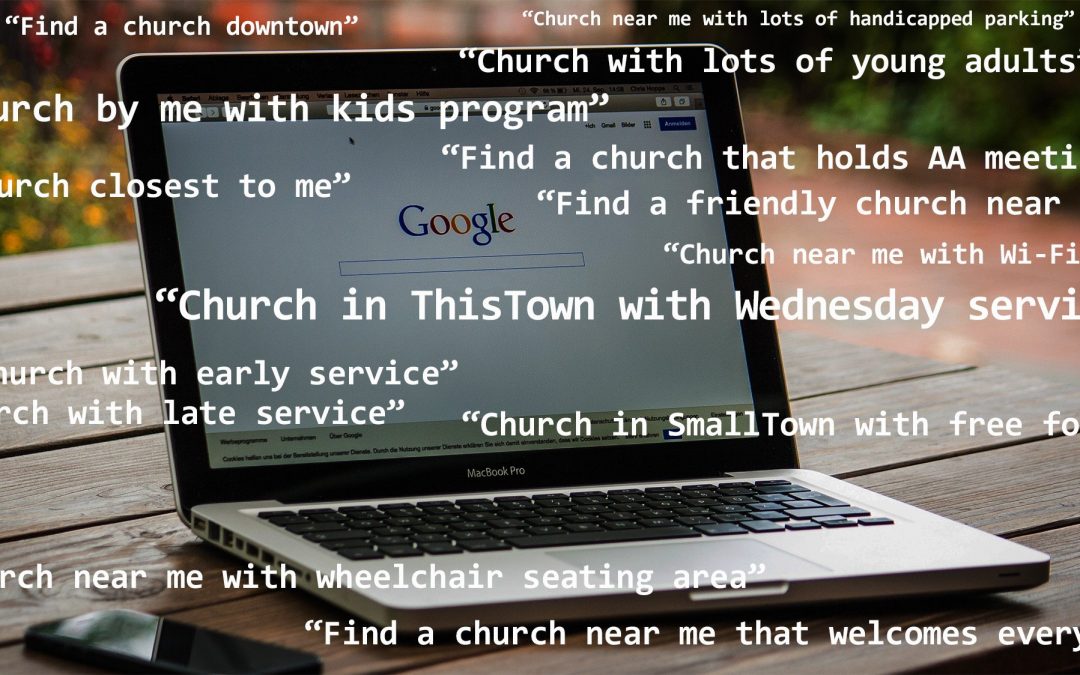
People are actively looking for churches near them, believe it or not. They type their searches into Google, into their map apps, or speak them to Siri or Alexa (which then use a search engine). But there are lots of churches to choose from, especially if someone isn’t typing a particular denomination in their Google or Bing search query. How can we make sure these seekers find your church? And once they do, how can you best engage them with your content and encourage them to connect with you?
You don’t have to be a genius web developer to do these 3 simple tips, just access to your church’s website management platform.
1) Talk to your visitors directly.
On your church website homepage, you may already have a “welcome statement.” While it’s nice to say, “Welcome to the ThisTown Church!”, it doesn’t directly address a visitor looking for a church to try out. Think conversational, like how you might talk to a visitor in person. It can be a simple yet direct statement similar to, “You’re always welcome at ThisTown Church! Join us on Saturday mornings for worship and Bible study” or “Here’s a safe space to grow your faith in Jesus Christ.” Use your congregation’s personality! Follow with a short intro paragraph that includes a brief description of your congregation, why you think it’s great, and invite visitors to join you.
2) No need to be the jack of all trades—master your ministry niche!
You want to cater to the needs of your community. But that’s a lot of needs! While one small town church can’t offer every program for every need, what you DO offer can help someone, and there’s likely several of those “someones” searching for just what you provide. Stick to your ministry niche! If you have cooking classes and a great youth program, make sure those are prominently featured, described in detail, and include calls to action that includes supporting details, such as where they enter their email, who they call, where they go to pay or sign up, when to arrive, etc.
Even if you just have a church quilt-making group, a delicious potluck, or a rousing Earliteen Sabbath school, feature your selling points conspicuously in your website content!
3) Make your pictures worth 1000 clicks.
While a picture of your church building on your contact page is helpful to those attending for the first time, feature more than just pictures of your building! Action pictures are great, from church events to Sabbath school programs to children’s stories to intricate visual demonstrations during a sermon. But even if you’re not able to get high-quality action shots, just get some smiling faces of families, young adults in Sabbath school with their Bibles open, kid singing up front, etc. Just make sure it’s clear what’s happening in the photo.
Candids can be terrific and sometimes very artsy, but it’s also more inviting when you feature eye contact from real church members, the pastoral leaders, etc. And some pictures are better than none!
Additional photo tips:
- Themes on many web development platforms, including several AdventistChurchConnect themes, allow for a “hero image,” or a screen-width introductory image (1600 pixels across) that sets the visual tone for your website, and it looks great on mobile screens! See here and here.
- Keep image file sizes small (under 200kb, unless it’s a hero image) or they will greatly affect your page load time—which both Google and your site visitors will count against you.
While this is just a fundamental sampling of all the great things you can do for a church website, just putting these 3 into best practice, especially if they weren’t already, can make a difference for your church’s online presence!
Another crucial way to boost your church’s “findability” in search engines? Make sure you’ve correctly and completely claimed your Map listing for Google, Bing, Mapquest, etc. Find more information about this in SEO 101: Lesson 5, coming soon!
For samples and ideas, check out https://churchjuice.reframemedia.com/blog/18-of-the-best-church-websites-for-2018


Recent Comments